ABOUT bet365
Bet365 Group Ltd is a British online gambling company based in the United Kingdom.
THE CHALLENGE
Carry out a UX review of the onboarding journey on bet365 from the perspective of a new user and redesign the sign-up form to improve the current experience.
Imagine you are a new user and you are having trouble completing the sign-up onboarding process.
Design Thinking
To solve this problem I used Design Thinking because I needed to empathise with what the user was experiencing to really understand the issue.
Problem
New users are having a difficult time completing the onboarding journey and sign-up to bet365.
Goal
The goal is to make more people sign up to bet365 and have higher customer satisfaction and consequently a higher conversion rate.
Hypothesis
I formed a hypothesis, which is nothing more than an assumption in a testable form, basically putting myself in the shoes of the user to understand cause and effect.
✍️ "Reducing the number of steps and the friction, users would have a more simple and convenient way of completing the sign-up process."
Business Opportunities
Now to business opportunities, bet365 was losing customers to competitors for not being able to provide a great experience around the sign-up process.
By creating a better experience around the onboarding process, bet365 would have higher traffic of users signing up for their product.
Competitive Analysis
Since this space of online betting is saturated, I wanted to explore what was currently successful and could be improved.
After analysing four competitors I learned that most of them have a single page for sign up and around 15 input fields and no obligatory deposit is needed.
Analysis of the Current Journey
Firstly, I created a user flow of what is the actual experience a new user has to go through right now to sign-up.
Secondly, I listed a few positive and negative points of the onboarding journey that could impact the end goal.
Positive Points
✅ Consistency - The design system used for the registration process is consistent with what the user experiences in the actual website. This makes the user feel acquainted throughout the entire process.
✅ Contact Us Button - On the top of the registration pages, there is a button to contact bet365 via email or phone, in case the user needs help to complete the forms.
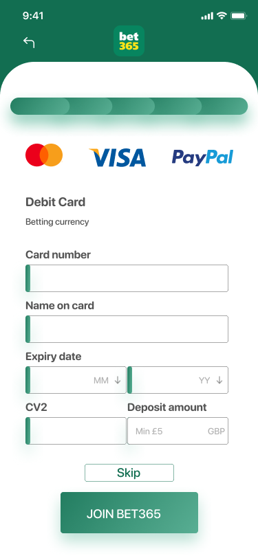
✅ Deposit Screen - The deposit screen is the clearest and most concise page on the entire registration process. The user will take less than a minute to complete this step and will be ready to start using the site after completion.
Negative Points
❌ Excessive Required Fields - There are 17 required fields on the first page alone. Every second that the user has to think about something is one step closer to them closing the website.
❌ Inefficient ID Verification - After completing the account details, the user is taken to an ID verification page, where they need t to send a picture of a document and support documentation. I had to contact bet365 via email because the system was not recognising any of my supporting documentation.
❌ Large Quantity of Screens - The user has to go through three lengthy pages to register. These pages are complex and lack engagement, taking too long for the user to complete.
Solutions
💡 Excessive Required Fields - Allowing users to sign up with their social media accounts and asking only useful information to allow them to use the service.
💡Inefficient ID Verification - Stating clearly which type of document is needed to complete the registration and the date range of the document.
💡 Large Quantity of Screens - Minimizing the number of screens.


New User Flow
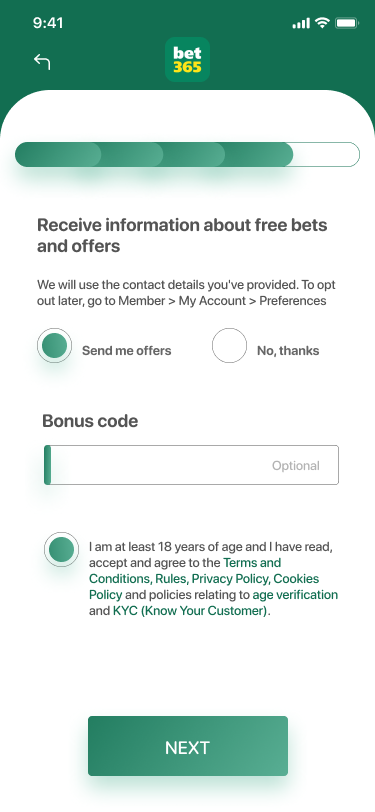
With the solutions in mind, I created a new user flow, with fewer required fields on each page and an easier understanding of the progress.
Brainstorm & Ideation
With the new user flow in mind, I started to brainstorm wireframes and added new features like a progress bar to gamify the journey and modals to help the user obtain the additional information without leaving the page.

Personal Information

Login Details

Verification of Your Account

Verification of Your Account 2

Verification of Your Account 3

Verifications

Payment
High-Fidelity Designs
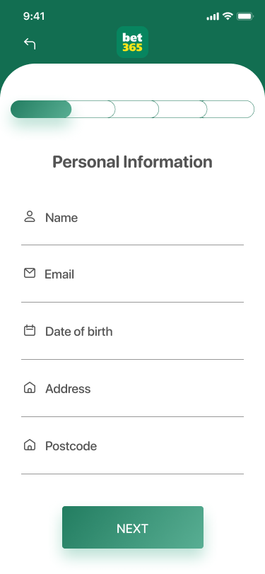
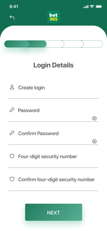
Since bet365 already has a design system and style guide, I tried to keep it consistent with what they have on their website and app.
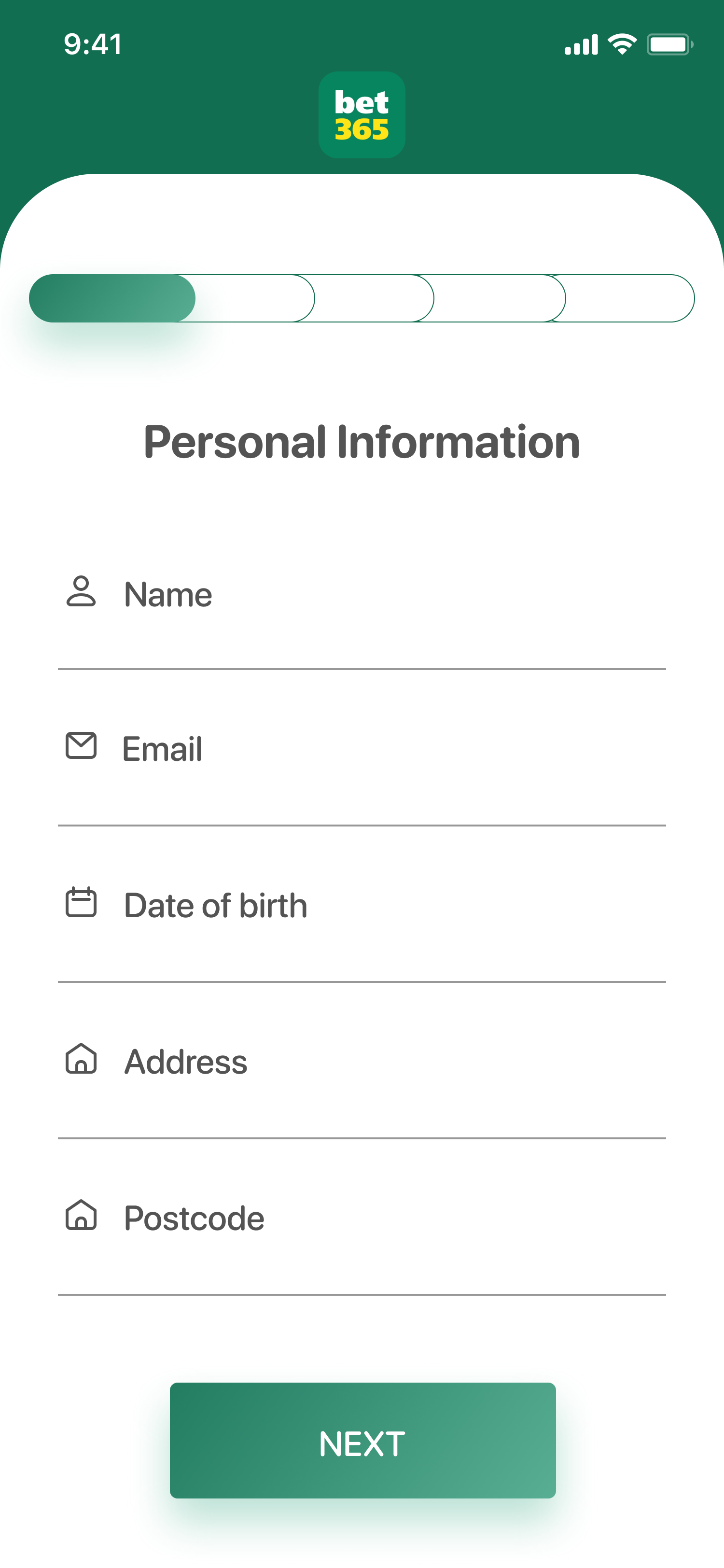
Personal Information
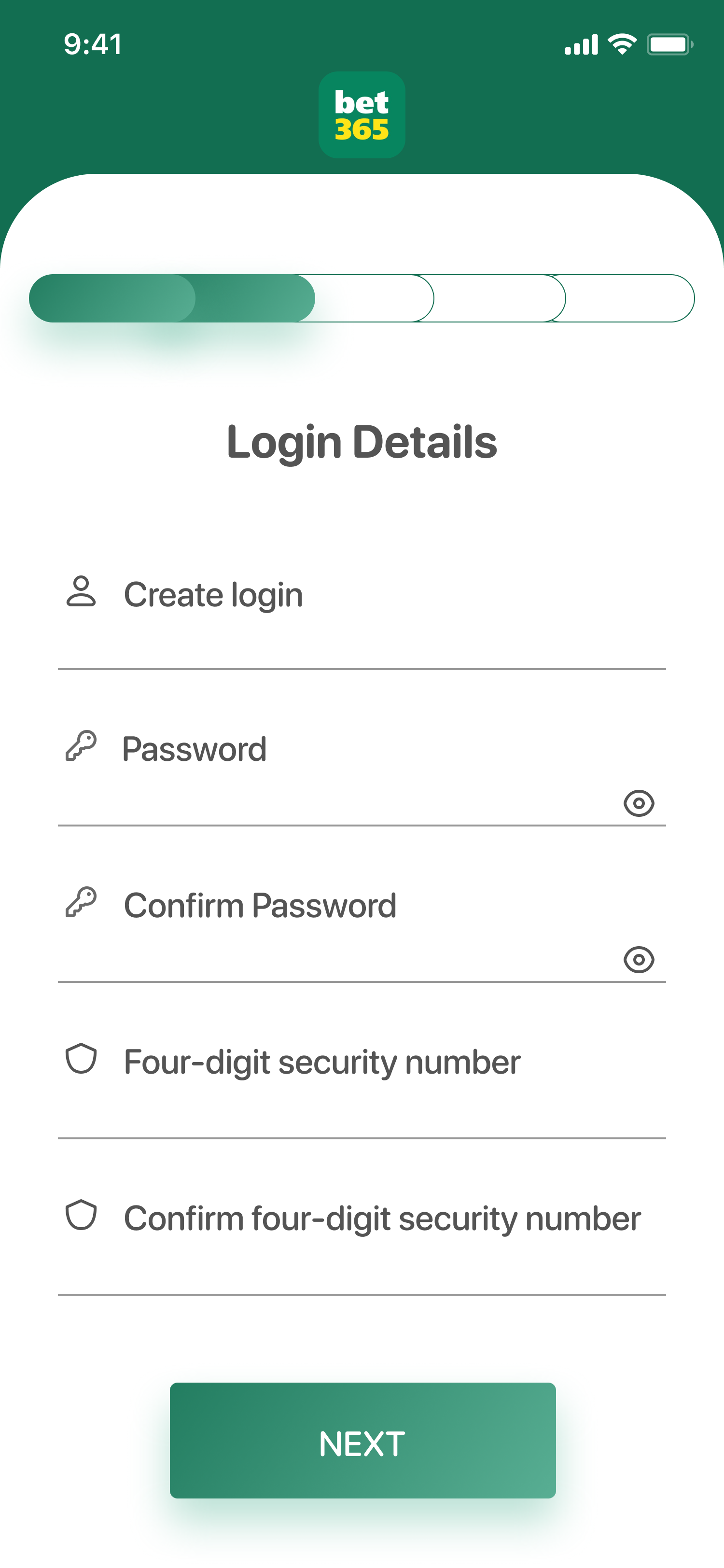
Login Details

Verification of Your Account

Verification of Your Account 02
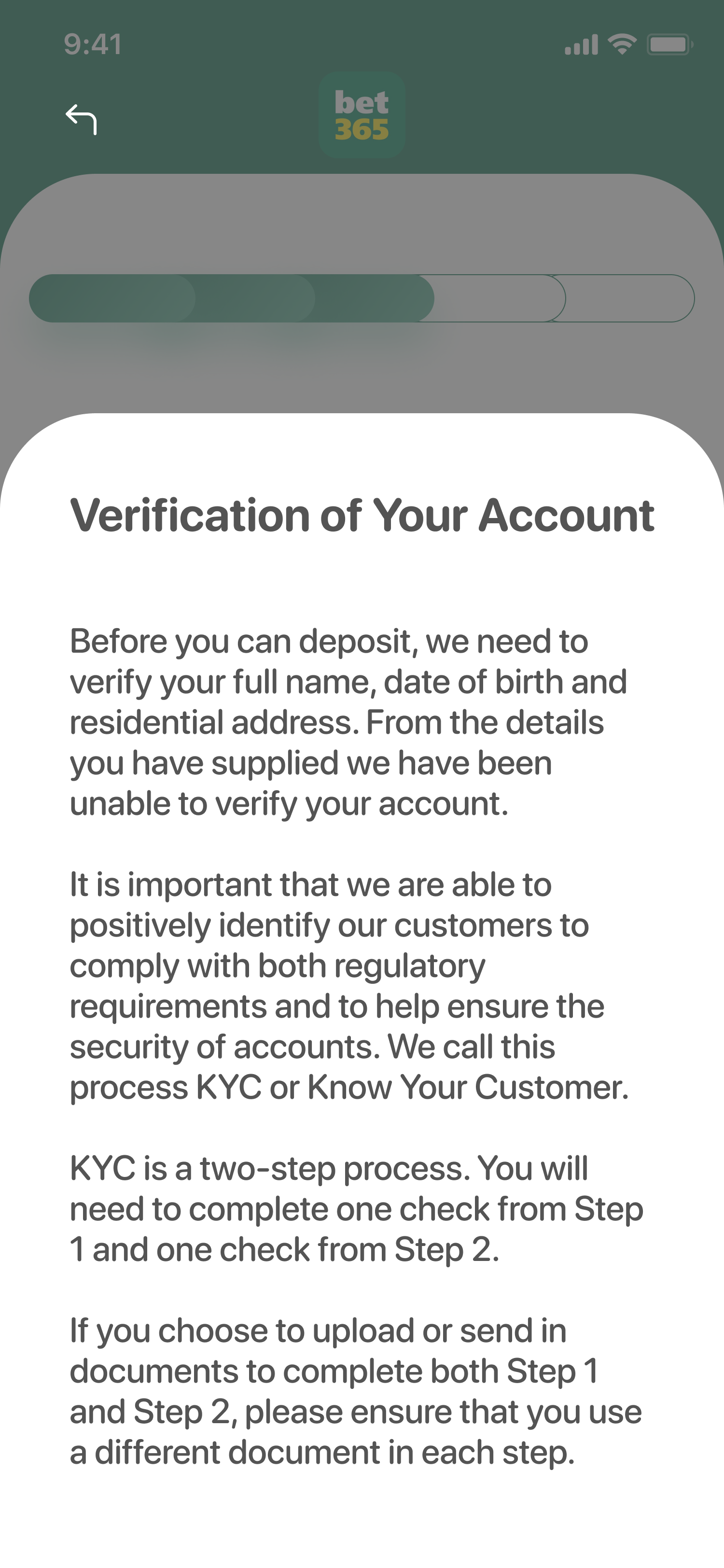
Verification of Your Account 03
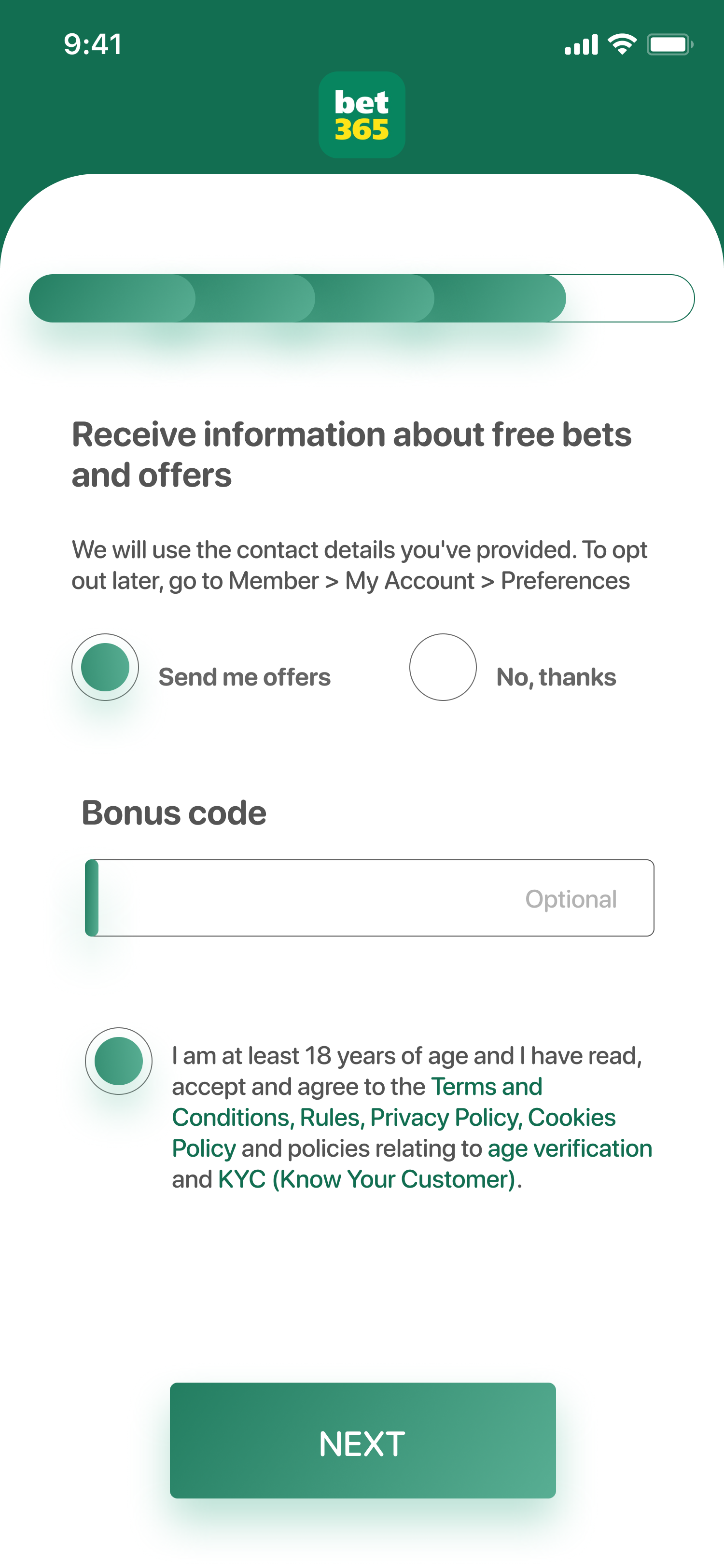
Verifications
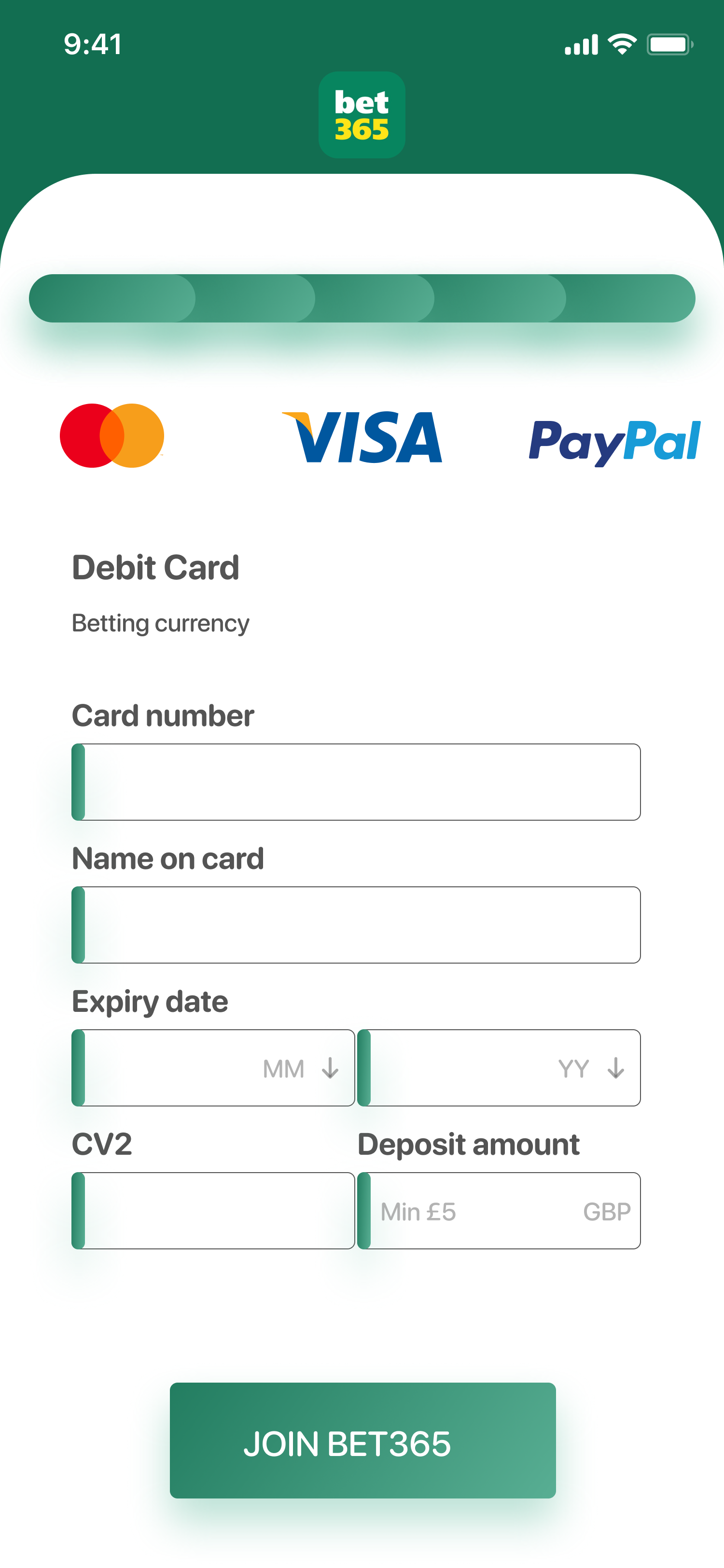
Payment
User Testing & Results
I presented a prototype of this version to 5 people via zoom for user testing and got a few insights:
🎯 100% of them concluded that the new process was a more efficient and effective way of signing up
🎯 60% wished that the deposit was not obligatory
High-Fidelity Designs
So I went back to the high fidelity design and introduced a way of skipping the first deposit.



Solution & Challenge
I resolved this issue by introducing a less-friction, fewer steps and overall minimising learning for the user.
Experiencing the problem first-hand is the best research. Although I was not able to collaborate with bet365 to the extent I desired, it turned into a riveting exercise to empathize with what it is like to be a new user trying to sign up.
My learnings & Next Steps
Working fully through this project taught me the importance of trying to think intentionally about every element of the project and how it can contribute to the end result.
If I had more time, I would further explore what other users think using techniques like user interviews, surveys or even A/B testing and also spend more time finding out how to integrate more accessibility to the sign-up process.
Thanks for scrolling!
If you have any feedback, want to collaborate or just want to say hello, let's get in touch!
